

Let’s talk about something that could make or break your YouTube success: your thumbnails! They are quite literally your video’s first impression, and you want to make it pop! But many of us are guilty of some common thumbnail faux pas. So, let’s dive into the top five things you might be getting wrong—and how to fix them ASAP!
Ignoring the Power of Contrast
Mistake:
If your thumbnail looks like it’s playing hide and seek with the YouTube interface, it’s time for a makeover! Lack of contrast can make your masterpiece blend right in with the crowd.
Fix:
Amp up the contrast! Bright colors against dark backgrounds (or the other way around) can make your thumbnail scream “click me!” Use tools like Canva or Adobe Spark to experiment and find that perfect eye-catching combo.
Overcomplicating the Design
Mistake:
Are you cramming every detail into your thumbnail? It’s tempting, but cluttered designs can confuse viewers faster than a cat in a room full of laser pointers!
Fix:
Keep it simple, superstar! Focus on one clear idea or emotion. Use a bold image and minimal text (if any). Your thumbnail should tell a story at a glance—think of it as a mini-movie poster!
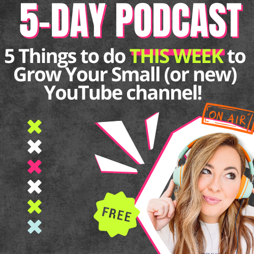
Get my 5 Day Podcast series!
Download my FREE podcast series and learn:
- 5 things you can do THIS week to grow your channel
- How these tips apply to you no matter if you have a current channel or if you're just starting out
- An easy-to-do action item each day to get your channel in tip-top shape
Using Small or Unreadable Text
Mistake:
If your text is smaller than a mouse’s heartbeat, good luck getting anyone to click! Tiny text can leave viewers scratching their heads instead of diving into your video.
Fix:
Go big or go home! Use large, bold fonts that shout your message. Limit yourself to 2-3 words and choose a font that pops against the background. Always test your thumbnail at different sizes to ensure it’s still easy to read—even on a tiny screen!
Restating Your Video Title in the Thumbnail
Mistake:
Okay, this is a big one over here at Hey Jessica. Just copying your video title onto the thumbnail? Yawn! Your thumbnail needs to be a visual treat, not a repeat.
Fix:
Instead of restating your title, use the thumbnail to tease or highlight the most exciting part of your video. Make viewers curious! Give them a taste of what’s in store without giving everything away—let that mystery work its magic!
Neglecting Faces and Emotions
Mistake:
Thumbnails without faces can feel like a party without any guests. No emotion? No clicks!
Fix:
Bring in the human touch! Clear images of your face (or anyone else relevant) showing strong emotions can draw viewers in like moths to a flame. Excitement, surprise, curiosity—let those expressions shine and make your thumbnail irresistible!
Conclusion
Your thumbnail is the first thing potential viewers see, so let’s make it unforgettable! By avoiding these common mistakes and adding a sprinkle of creativity, you can craft thumbnails that not only stand out but also encapsulate the essence of your video. Remember, a fantastic thumbnail can lead to more views, more engagement, and more growth for your channel. Now, go forth and create those eye-catching thumbnails—your audience is waiting! 🎉


+ show Comments
- Hide Comments
add a comment