While having a “perfect Instagram feed” isn’t as important as it was three years ago, it can definitely help. Especially when you create a cohesive Instagram aesthetic that works for YOU!
I remember during the beginning of my Instagram journey I would look through countless Youtube videos and blog posts for tips to help me create my own “drool-worthy” feed without success.
In this post, I’m sharing with you 5 TIPS to create a cohesive Instagram aesthetic so you can make your feed suit your look and branding. Let’s start with the basics and then get to the nitty-gritty that not a lot of people talk about!
5 Tips to Create A Cohesive Instagram Aesthetic

#1 Know Your Colors
This falls hand-in-hand with knowing your brand. If you already know your personal brand colours, then you’re one step ahead!
If you don’t have brand colors yet, then don’t panic! A simple Pinterest search on “color psychology” and “brand colors” can give you a nice head start.
When you have 3-5 colors, you want to make sure you are using them when editing your photos and keeping the focus on those colors.
Get the Digital Product Blueprint
#2 Use Presets
I’m sure you’ve heard this tip before, but that’s because it has some value to it!
If you want your photos to have the same overall look and feel, try to use the same pre-set or edit on each photo. This helps to ensure you are maintaining the same colouring and consistency within your feed.
If you don’t know where to find presets, or you are not able to afford them at this time, go to Pinterest and search “VSCO free filters.” Voila! You should now be bombarded with stunning filters that you can use on the VSCO app to make your own perfect preset!
You can even narrow down the search on Pinterest to find filters that suit your specific style: bright, vintage, minimalism, or whatever your heart desires!

#3 Stick to Your Colors
Shoot only in the colors that you want in your feed. Wear them. Be them.
Once I understood this simple mindset shift, everything clicked and the whole process of making my ideal Instagram feed became so much simpler!
Go to your favorite influencer right now and you’ll probably notice they do this too. They most likely only wear colors from the same palette in almost every photo, and that is how they've managed to establish that dreamy-looking feed.
#4 Plan with Purpose
This is something I can never say enough! Plan your feed ahead of time. When you do this, you can create patterns with your colors, composition, or graphics.
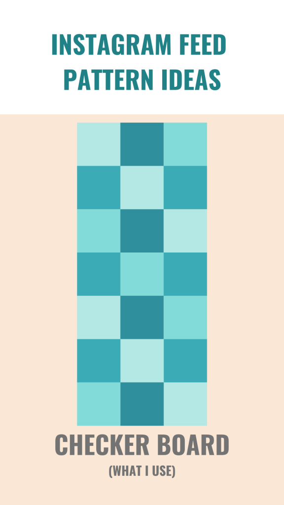
Here are 10 different pattern ideas that I made for you to look at and see what you think would fit your feed best!
I like the checkerboard pattern, which is where I switch between orange and teal, then alternate every other photo to be either a close-up or full body photo.
Making sure you have a pattern to guide your feed will help create a cohesive Instagram aesthetic.
#5 Master Your Editing
Here’s a part A, part B editing tip for you.
- Focus on the “whites” in your photos and make them all the same shade! If you’re taking photos in different lightings, then the white balance filter is going to be your best friend!
- White balance is the process of removing an unrealistic color shade. So, an object which appears white in person, such as a wall, is rendered to be true white in your photo.
- Play with the “HSL”! You can turn oranges to red, blues to greens, and more!
- If you’re using LightRoom or VSCO, there is an option called “HSL” which stands for “Hue, Saturation, Lightness”. You are able to manipulate SPECIFIC colors in a photo.

+ show Comments
- Hide Comments
add a comment